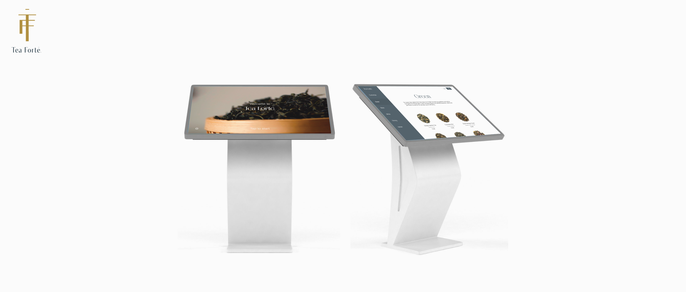
Tea Forté Kiosk
Sip, shop, and swipe with this kiosk for the online tea store!
Tea Forté is an online tea shop that sells a variety of prepackaged loose-leaf teas and products. In this project, I was tasked to translate its website catalog and content in order to create an in-person kiosk.
Software
Figma, Photoshop
Duration
15 weeks
Role
Solo project
THE PROBLEM
Online Store to Physical.
This project consists of a scenario in which the online store would open up a physical brick-and-mortar store. Additionally, there is a need for customizing your own loose-leaf tea as this is not an option currently.
THE SOLUTION
Efficency and Customization!
I have to work out which important information to keep and which to omit when creating the kiosk. Also, adding customization will allow users more freedom when choosing products.
HEURISTIC EVALUATION
I Explored other Kiosks and the Original Website.
I went to analyze existing kiosks and the original Tea Forté website in order to better understand what qualities make a great kiosk and what features from the original website can be transferred and which assets had to be reworked.
Taco Bell
I was fortunately able to visit Taco Bell's kiosk in person. I had fun playing around the screen to see what I was able to order (ex. 100+ burritos with nothing in them) and learn more about screen and hardware accessibility guidelines.
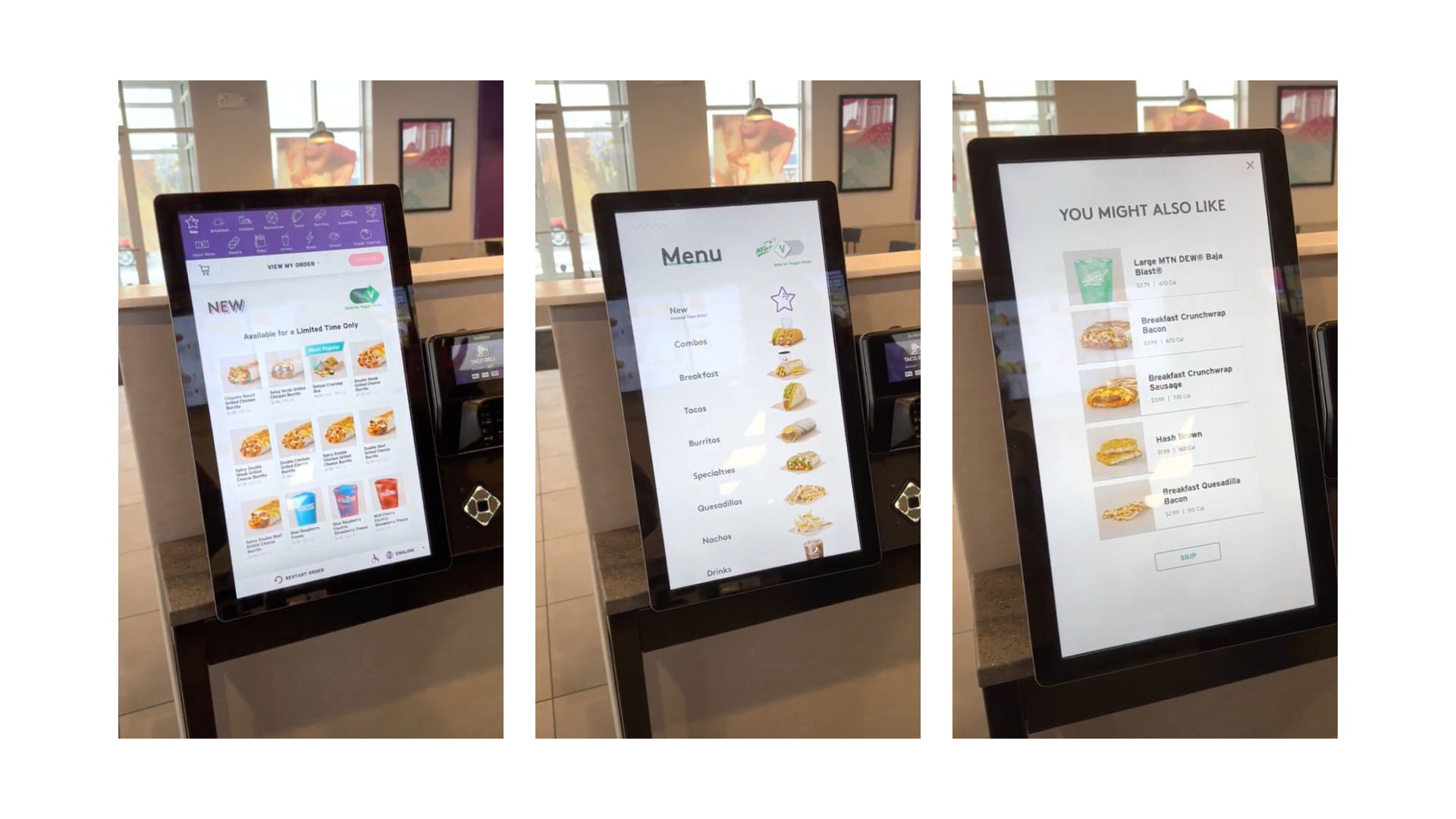
What already works
Consistency- identical words, situations, and icons mean the same thing throughout the whole process.
Visible- options are readily available and minimize user memory load to recall important information.
Minimalism- dialogue and instructions only contain relevant information.
What can be improved
Redundancy- there are written words such as "cancel" or "exit" alongside an x in the corner that can potentially confuse the user.
Error Prevention- there are no limits, warnings, or error messages for how much a user can order or what ingredients can be added/omitted.
Documentation- there are no descriptions of items or ingredients.
Tea Forté Website
I analyzed the original website to better understand what needs to be included in the kiosk and what needs to be omitted for the different platform.
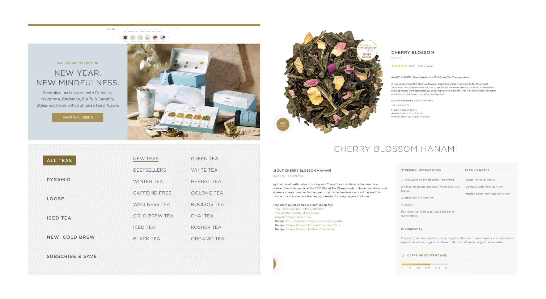
What already works
User Freedom- products are clearly labeled with added important content such as caffeine levels.
Hierarchy- options are readily available and minimize user memory load to recall important information.
Assets- text and photos are already in the appropriate resolution and style.
What can be improved
Redundancy- there are multiple navigation bars that lead to the same products.
Excess- there is information that would be unnecessary when transferring devices, such as brewing directions and recipes.
Accessibility- text, buttons, and visual assets will have to be resized in order to better fit the new device's screen dimensions.
GOALS
What Do I Want to Accomplish With This Project?

Accesibility

Efficiency

Profit
I am going to mainly focus on creating an accessible and inclusive design by creating a screen that is wheelchair-accessible. Additionally, assets such as buttons, will be enlarged for those with lower vision.
Using workflows, I can plan, organize, and empower a user, regardless of technological ability, to be able to smoothly use the kiosk. This will allow for more in-store traffic as it lets users choose either the kiosk or checkout counter.
Introducing the customization option, and including bundle options before checkout, will allow users to make, add, and shop a variety of products. Tea Forté will be able to push both low-selling and popular products before checkout.
USER CONSIDERATIONS
Accessibility and Inclusivity are at the Forefront.
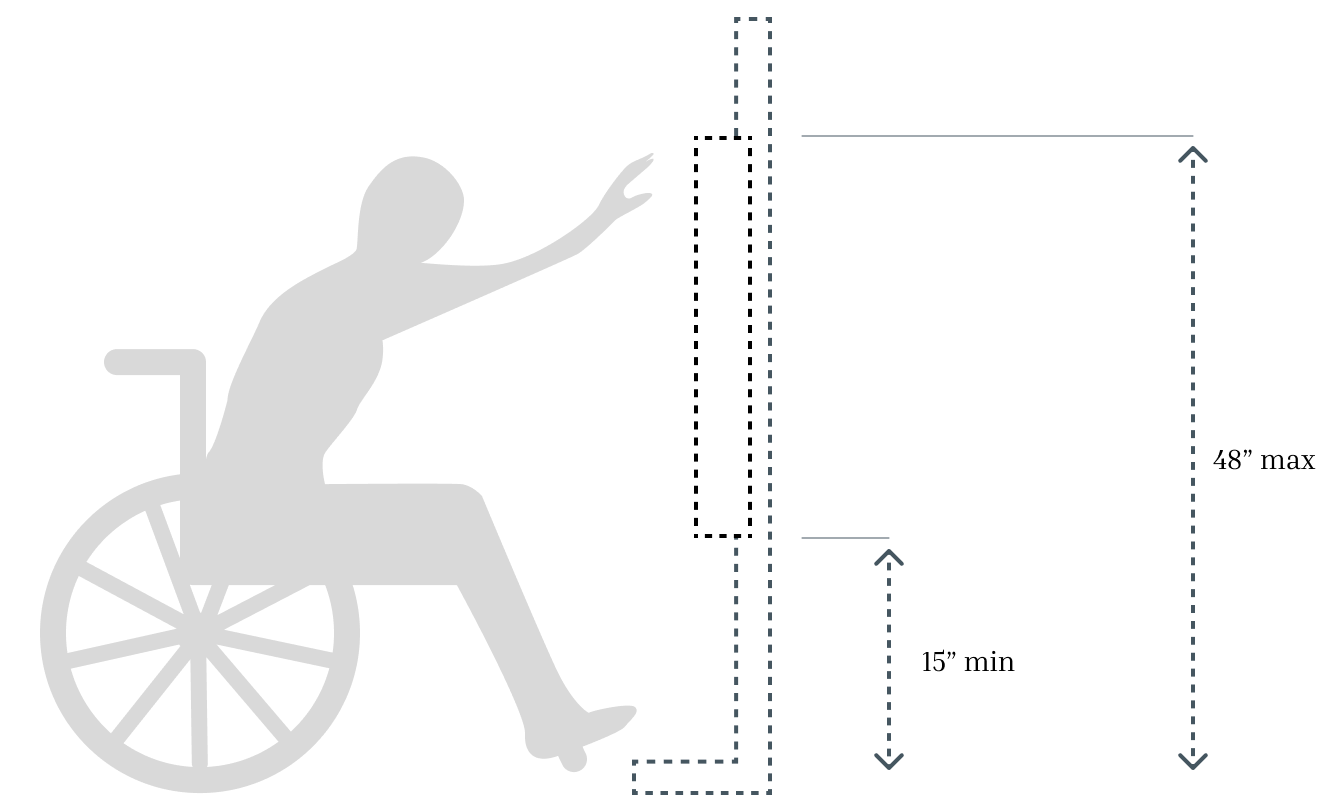
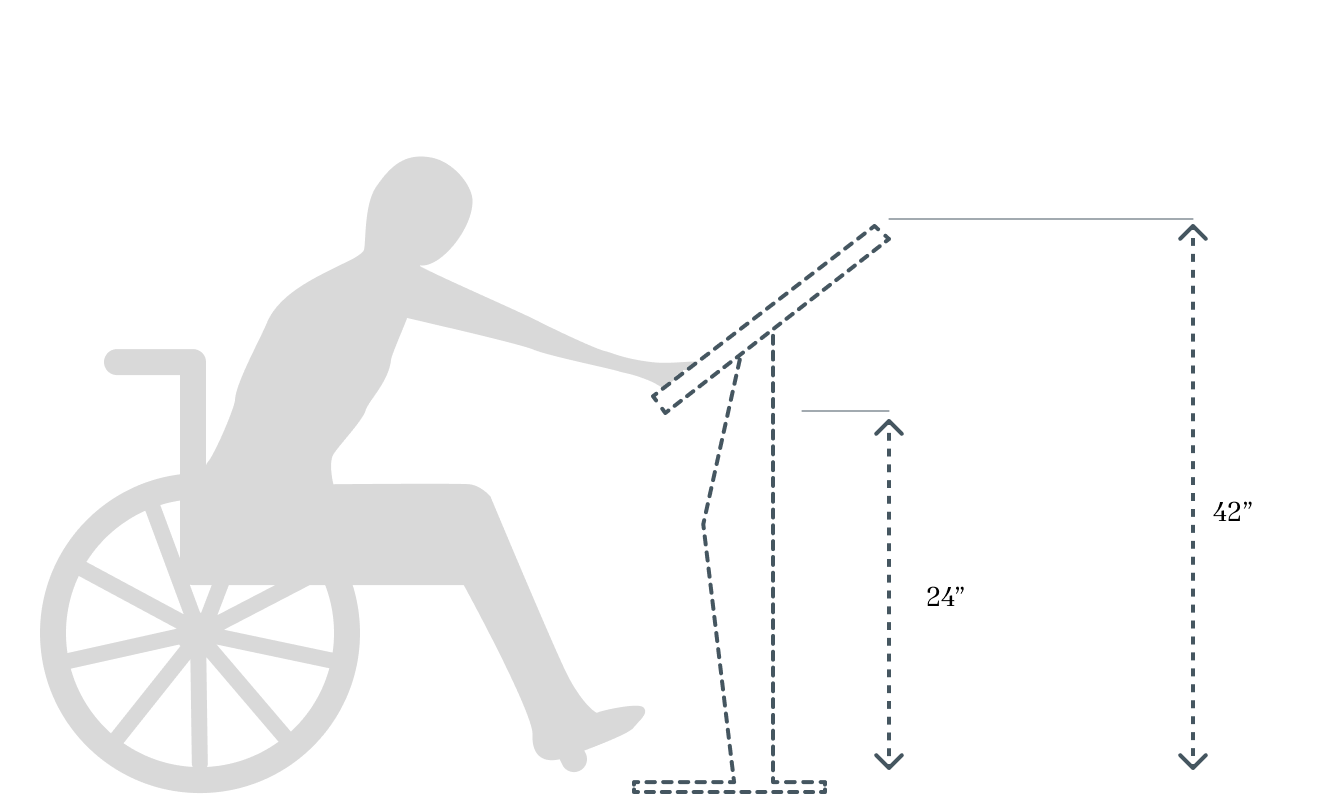
The target audience for this kiosk would be new and already-established fans of the online tea brand Tea Forté. For as many tea lovers to be able to use the kiosk comfortably, including wheelchair users, I reviewed the ADA guidelines when designing the kiosk hardware and screen size.
The kiosk will only accept physical and digital card payments with a small scanner and receipt printer under the screen. This will allow there to be no major obstructions for wheelchair users. The screen will be 15" from the floor and 38" overall.
ADA Regulations
My Design
USER JOURNEY
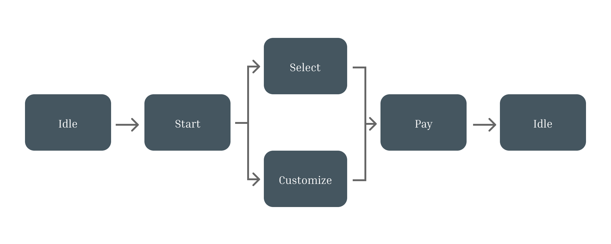
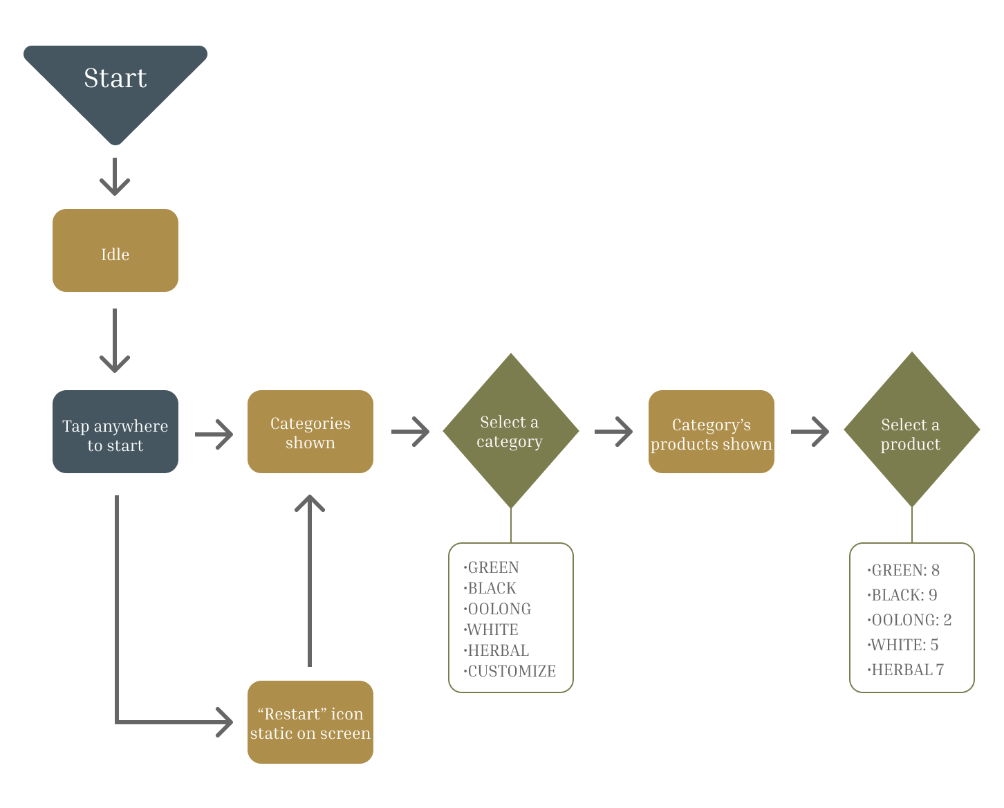
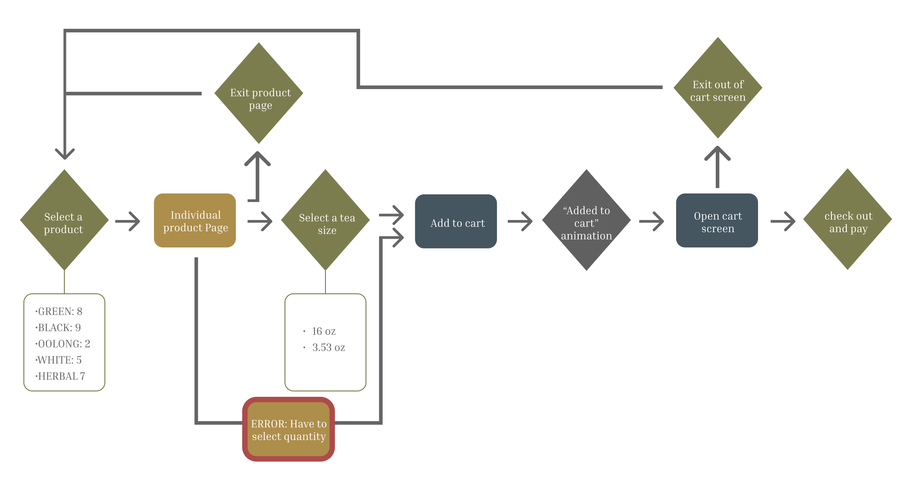
Using Figma, I Created Multiple Workflows.
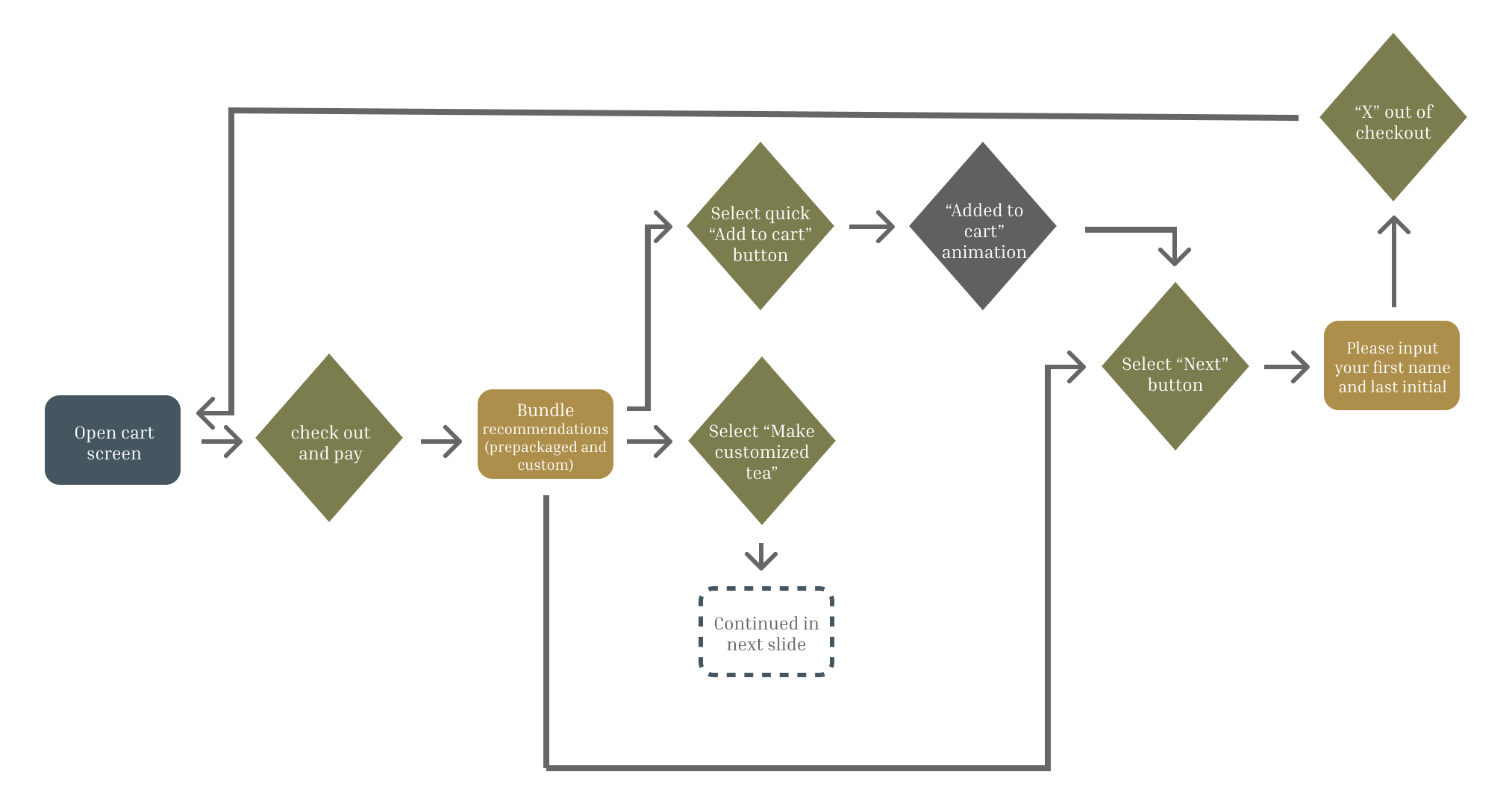
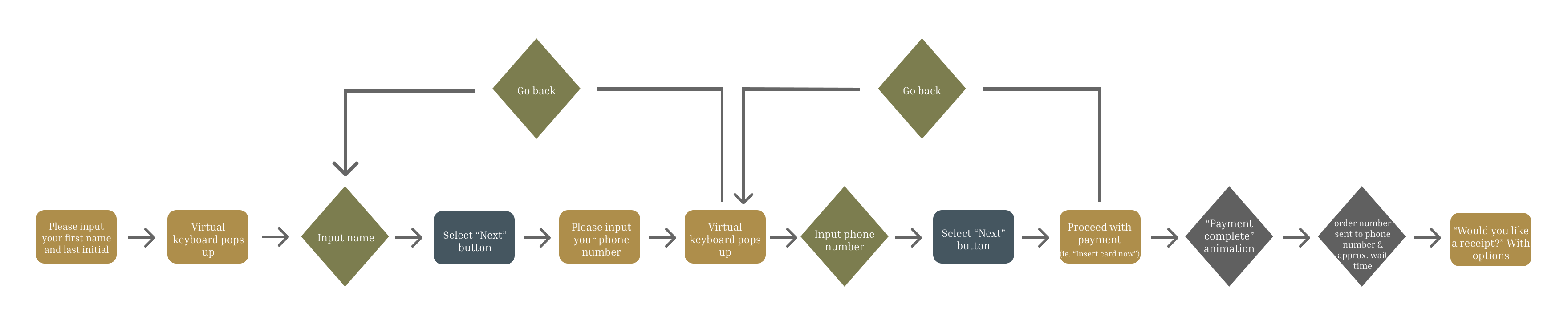
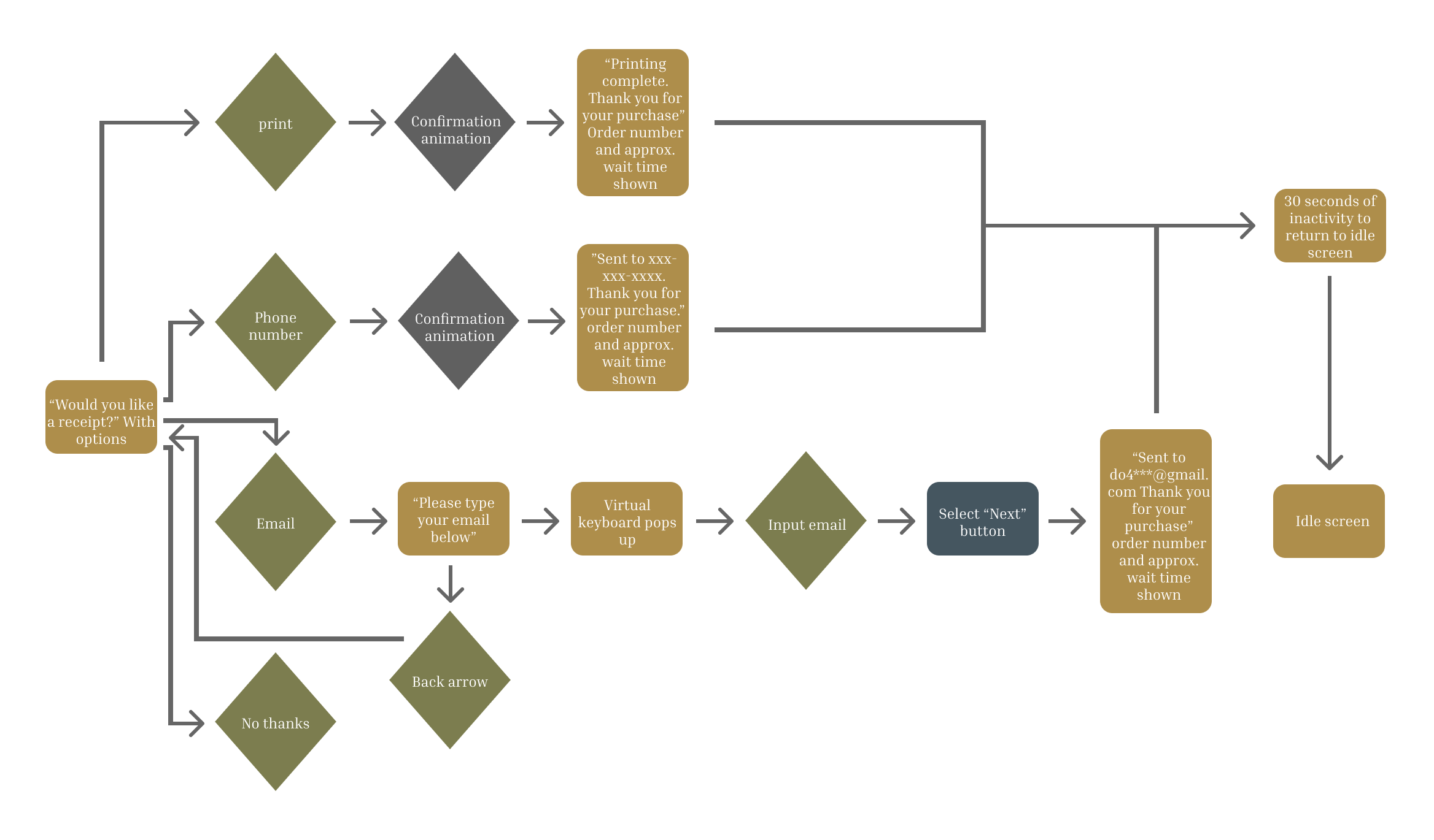
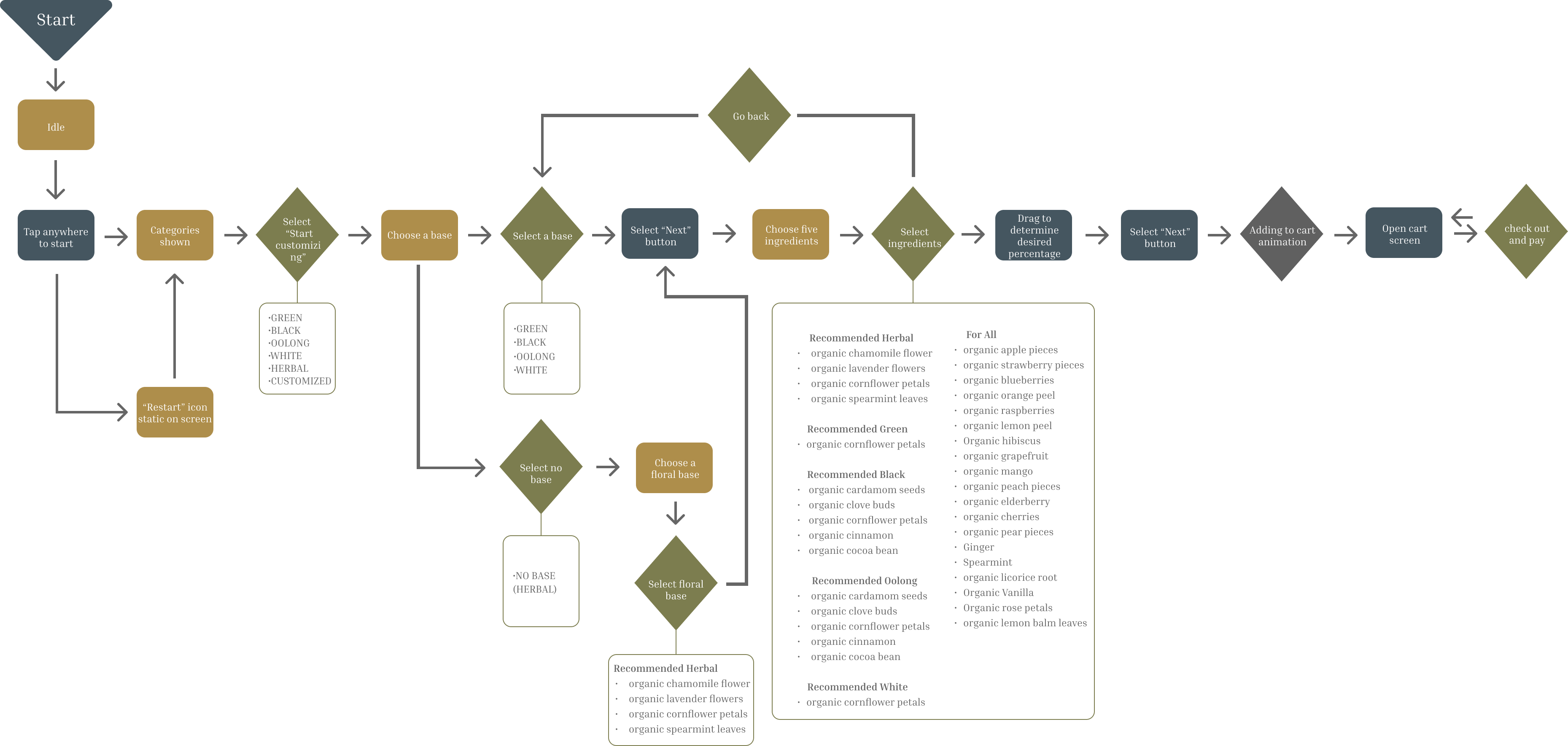
This allowed me to properly organize all possible choices, instructions, and dialogue the kiosk might present and users can choose from. The workflow is divided into two main components, one for buying prepackaged teas and the other for making and purchasing customized teas. A planned a basic sequence to showcase a simplified kiosk user flow.
Key
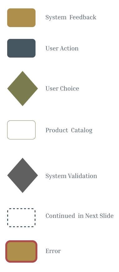
Idle & Product Categories
Product Page & Add to Cart
Bundle
Completing Order
Print Reciept
Tea Customization
RAPID PROTOTYPING
As I Prototyped, I Centered User Experience.
For the timeline given, I created various solutions for the main and customization screens efficiently. I focused on keeping the necessary components that Tea Forté already included on their website, such as the caffeine content and ingredients. Additionally, I focused on the screen size and made sure buttons and text would be accessible and visible to most humans.

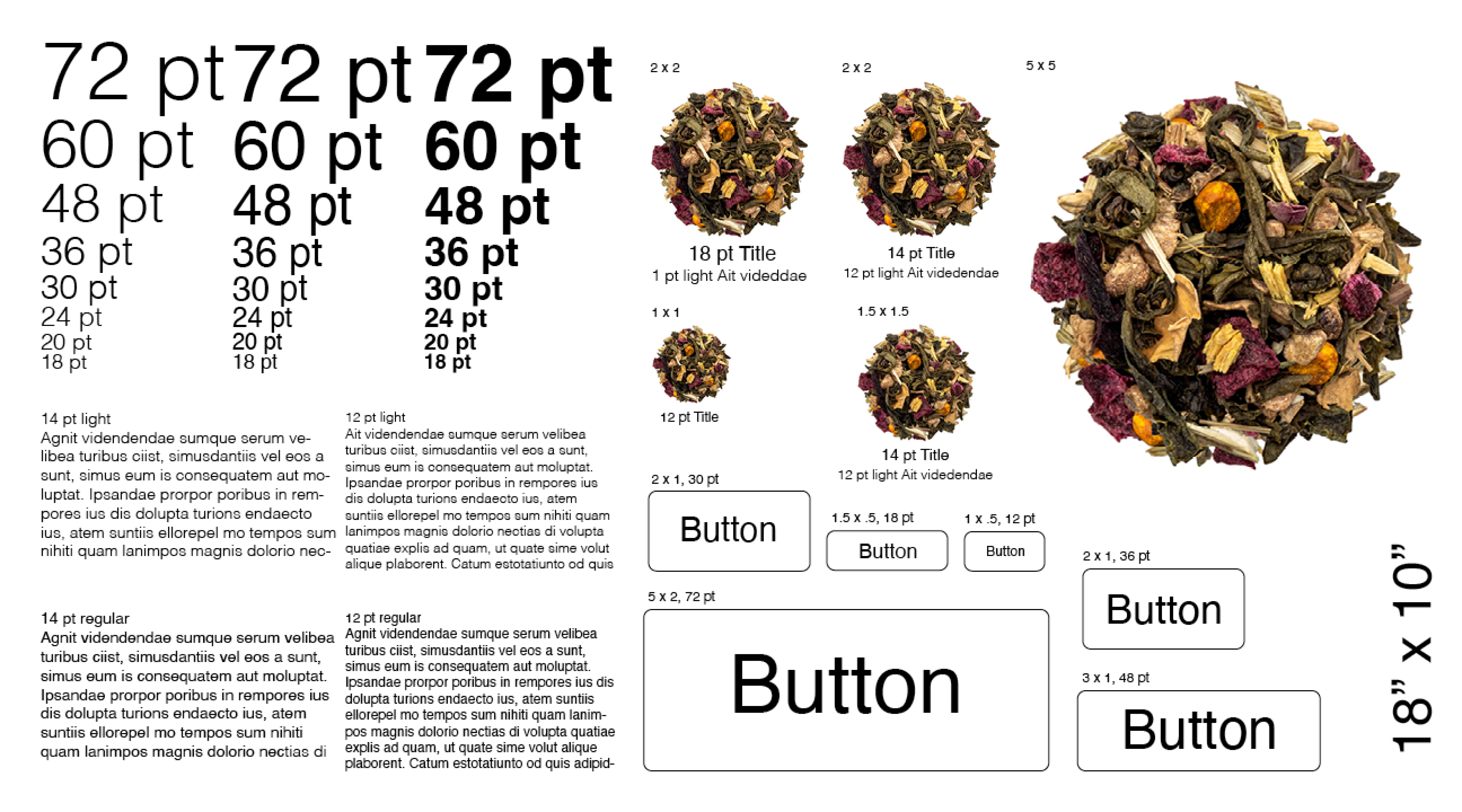
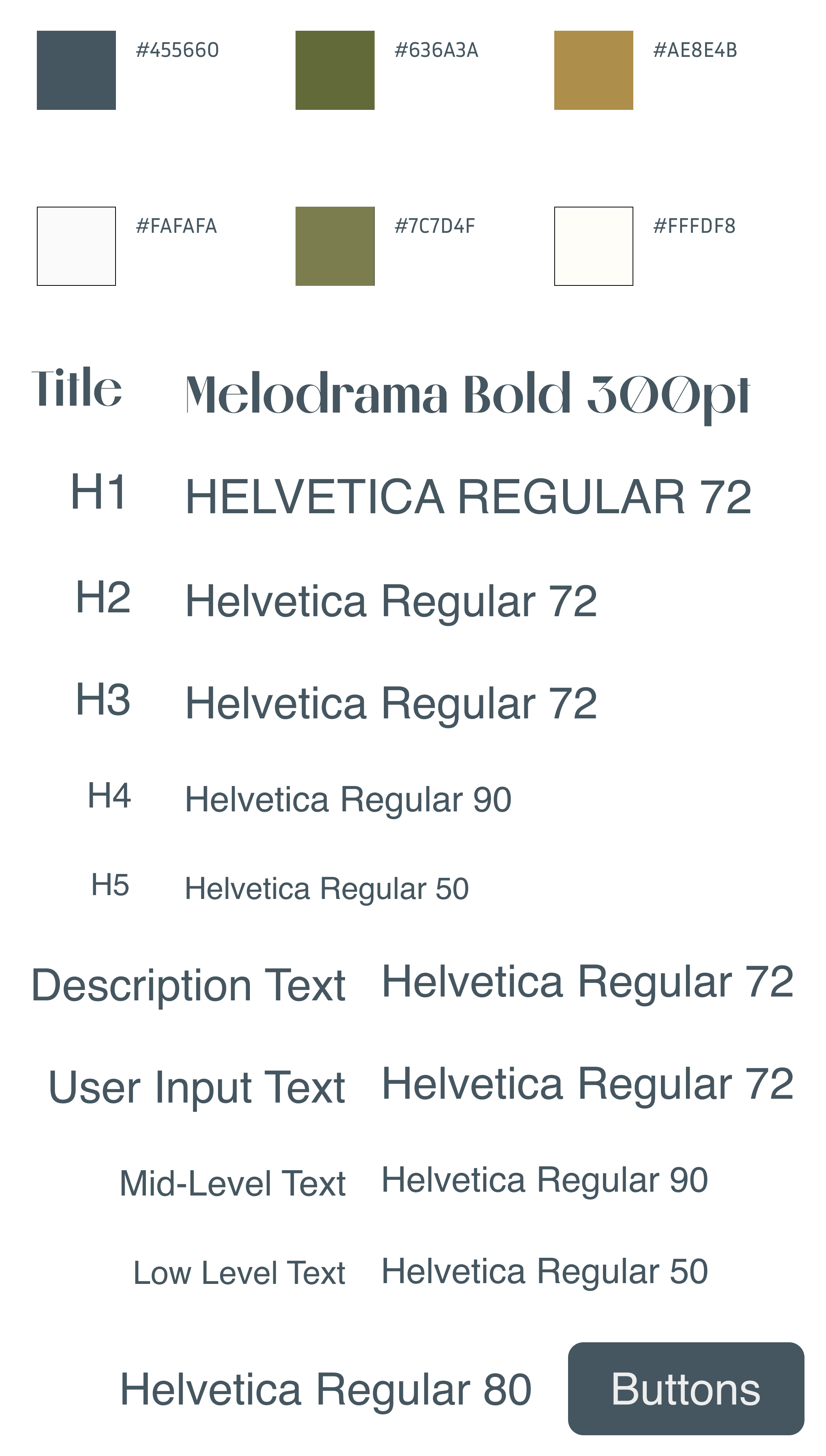
STYLE GUIDE
I Focused on Expanding the Established Brand.
I physically measured and printed the screen in order to form a concrete visual guide. Overall, I decided to continue with the established branding so new and old fans alike could make a connection to the online storefront. For the colors, I continued using muted tones, choosing an overall blue design with green and yellow as accent colors. For the typography, I chose a readable sans serif for most of the body text and a thin serif for the titles.
SOLUTIONS
I Brought the Preminilary Designs to Life.
While creating and prototyping the solutions, I focused on my three main objectives: accessibility, efficiency, and profit-making.
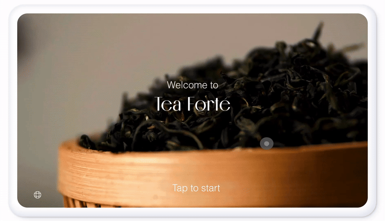
Idle and Categories
I selected this enticing idle screen because of its intriguing subject matter, which plays until a user comes up and interacts with it. To be inclusive of all tea lovers, a language option in the bottom left uses a universal global icon. In the first category screen, to get the user started, they can select whether they want to customize a tea or browse prepackaged teas. Once inside, there is a navigation on the left-hand side to further aid in exploration.
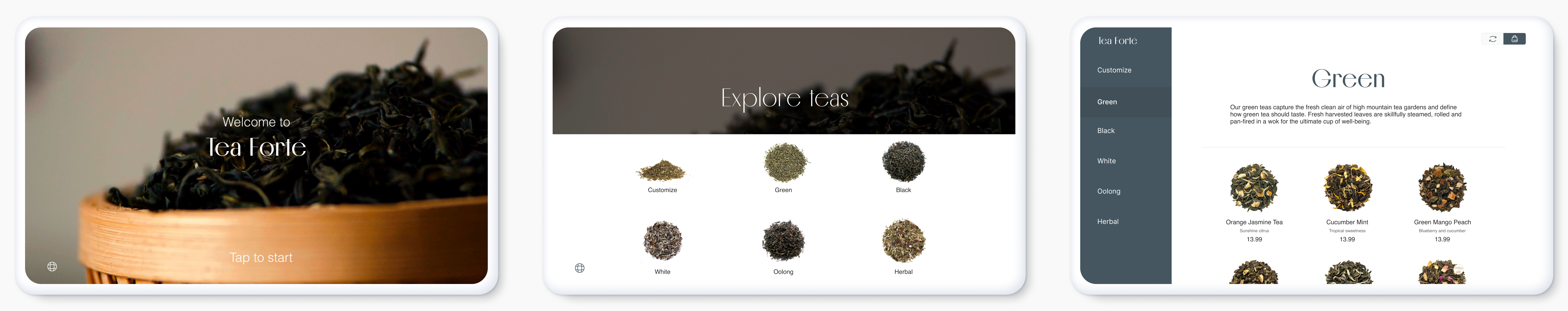
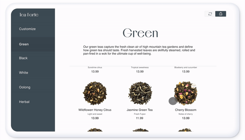
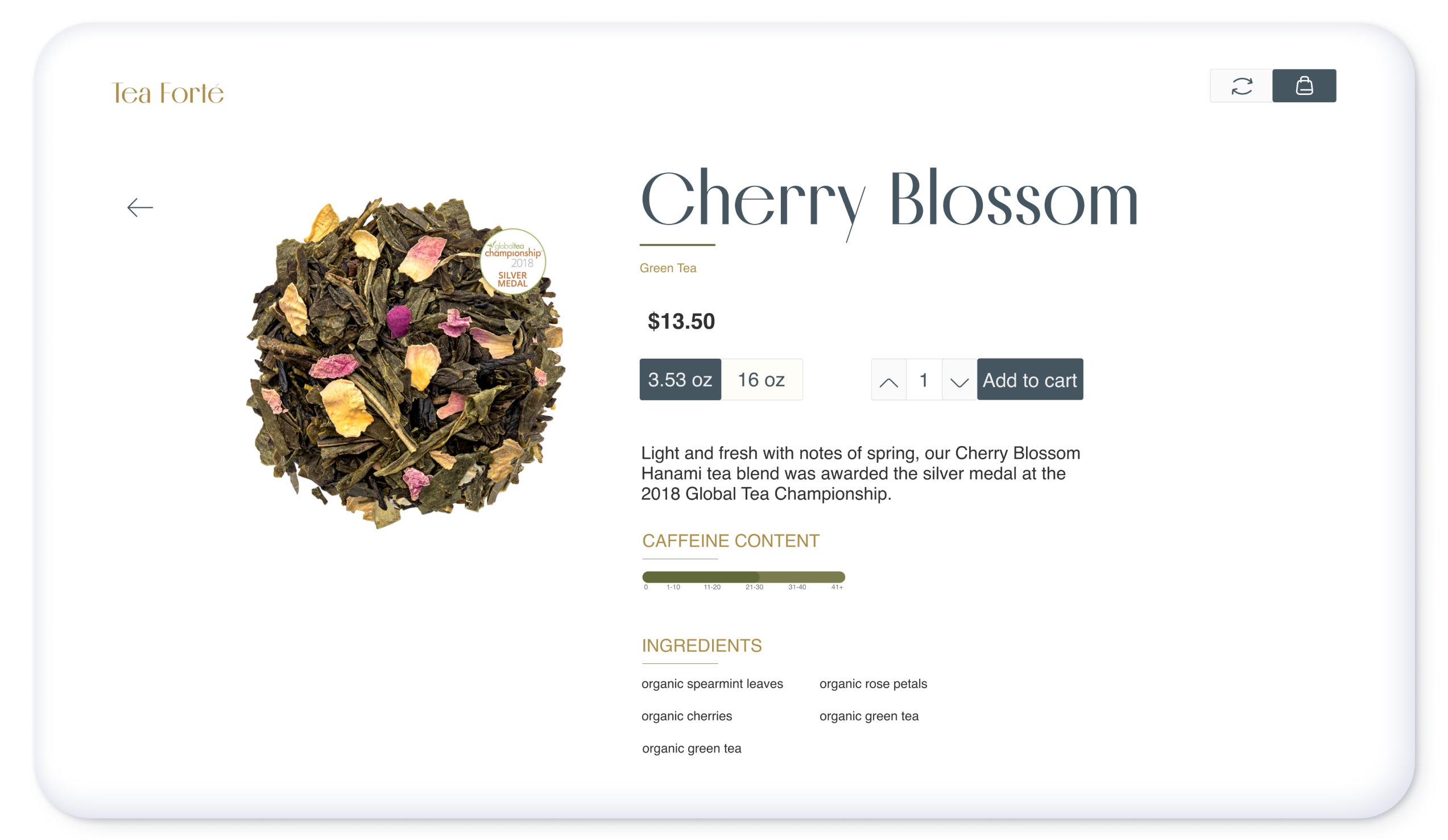
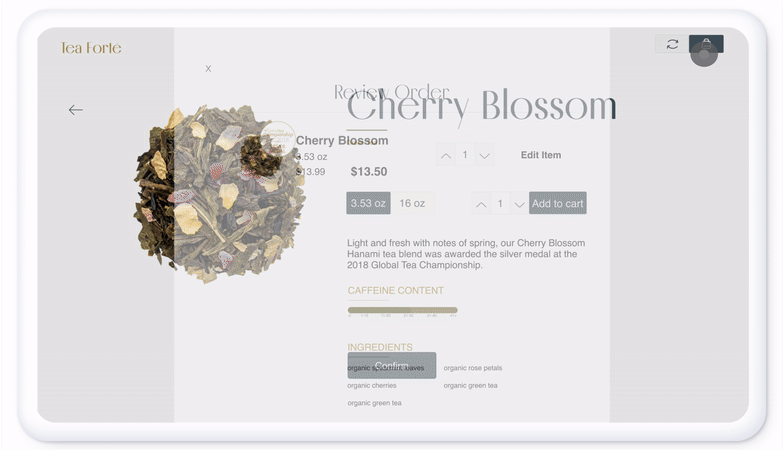
Product Screen
For the product featured, I decided to keep it as a single screen that does not scroll. I omitted some items from the original website, such as the reviews, tea color, recipes, and brewing instructions. I believe these features to be secondary and can included in the physical packaging. Buttons were enlarged in order to fit the new medium The most important information, such as the caffeine level, ingredients, and small blurb of each flavor, were kept as it is vital for the user to know this information when making a purchase.
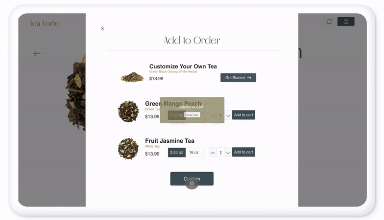
Cart and Bundles
Implementing the bundling feature was important to me because it allows the user to quickly choose items that they might like as they pair similarly to the preexisting order. As I have previously mentioned above, this is also a great way for the brand to push new and on-sale items. Additionally, it was critical to ensure the bundle option was placed after confirming an order but before making a payment.
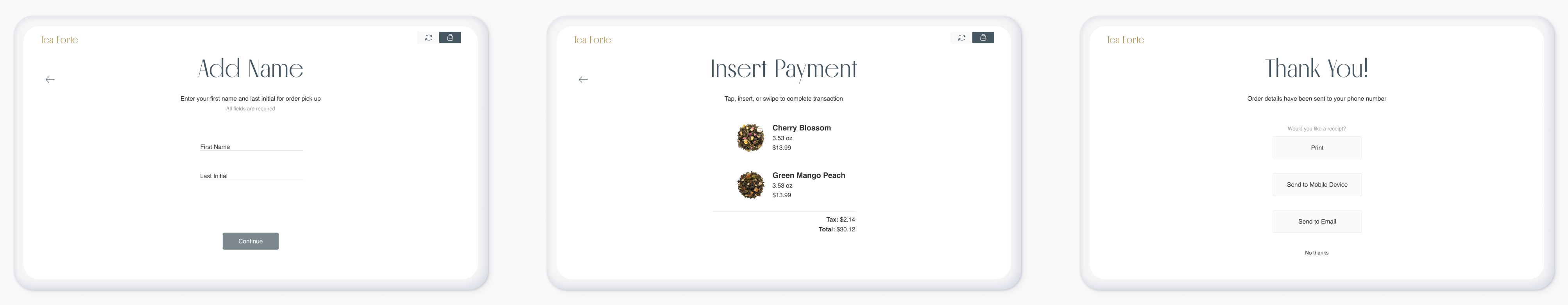
Complete Order
While creating these screens, I was tasked with figuring out how to showcase if certain fields were required or optional in order to progress. Here I showcased that by making the "Continue" button grayed out until all required sections were filled.
Payment options are limited with a physical scanner under the screen. The kiosk only accepts cards and digital wallets. Afterwards, a message will be sent to the user's phone number with their order information and when to pick up their item(s).
TAKEAWAYS
I really enjoyed working on the user experience.
I really enjoyed working on this project as it involved researching a brand I was already familiar with and its extensive catalog. As I work further on this project, I would like to implement more micro-animations throughout the design. Overall, I had a fun but challenging time creating the final visual designs as I wish I could have continued researching and analyzing more. This project made me realize how much I really liked researching the user experience side of things, which I hope I am able to continue with in the future.
Let's connect!